April 14 2016

Acrylic Rocking Horses and Smile Stools by Nendo

My old time friend, Jaime Derringer of Design Milk, just put out a story on CNN titled Salone del Mobile 2016: The 15 most desirable objects in the world right now. Jaime’s got an incredible eye for design and the way she explains design to the world makes her an excellent communicator.

This year, she got to attend Salone del Mobile, an annual design fair that takes place every spring in Milan, Italy. It is the largest exhibition in the world for design, which encompasses furniture, lighting, and home furnishings. It’s basically the Art Basel of the design world.

As she writes:

“The objects of luxury I’ve chosen here are only a small representation of the creative talents displayed in Milan this year, but they are some of my most coveted items. These objects are made to be talked about, to be in the spotlight, and to set the bar, so let’s give them their shining moment.”

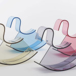
One of her top picks is the all-acrylic modern rocking chair by Japanese designer Nendo. Called the H-horse, it can stand alone as a beautiful sculpture, though it’s meant to be ridden.

smile-nendo-11

At this year’s Salone del Mobile, Nendo also put out these stools that were inspired by the shape of a smile. Happy faces can be found as imprints on the seats. Want!

via [CNN, Wallpaper]

April 13 2016

Mario Testino’s New Show in Copenhagen

When I made the list 8 Photographers That Made Me Fall in Love With Photography I forgot to add one very important person. Peruvian-born photographer Mario Testino has work that has graced the pages of such publications as Vogue and Vanity Fair and he’s shot for such fashion houses as Versace, Gucci and Burberry. One of his most recent editorials was a breathtakingly beautiful one featuring girl-of-the-moment Gigi Hadid alongside her rockstar boyfriend, Zayn Malik.

Testino has a gift for capturing everyone’s best side, it would be a dream to be photographed by him. The closest most of us will probably get to that is viewing his work at a new exhibition in Copenhagen, Denmark. Starting May 12, visitors will be immersed in Mario Testino: No Limits, a show running over three levels of the gallery. The three overarching themes of his practice will be on view, his fashion and iconic portraiture, royal portraits and austere nudes. How I want to go!

Above: Sienna Miller, Rome, American Vogue, 2007

mario

Stella Tennant, New York, American Vogue, 2006

mario-testino-03

Kate Moss, London, British Vogue, 2008

GL Strand website
via Wallpaper

April 12 2016

TED Talk: The Magic Ingredient that Brings Pixar Movies to Life

If there’s one movie studio that has my heart it’s Pixar. I was lucky enough to visit their HQ back in August 2011 when story artist Josh Cooley invited me up for an interview. Ever since I saw Toy Story I’ve been a fan of Pixar not just because of their groundbreaking animation work or their captivating storytelling but because of how they run their company. (For more on that read Creativity Inc.)

Back in November, Danielle Feinberg, Pixar’s director of photography, gave an inspiring TED talk called The Magic Ingredient that Brings Pixar Movies to Life. In it, she talks about how Pixar uses math, science and code to create magical worlds. Mostly, it was inspiring to hear about how she, personally, found her true calling. I love people with passion!

via [Mac Observer]

April 12 2016

Fun Sea Creature Planters

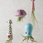
These funny planters crack me up! The hanging vessels were designed for Anthropologie by Californnia potter Cindy Searles. They’re completely handmade using porcelain and wire. The four planters comes in small squid, octopus, jellyfish and large squid. I love how the plants are suppose to hang down like arms or tentacles. (While we’re at Anthropologie’s page, check out their cute whale doormat. I’m a sucker for animal-inspired things.)

sea-creatures-02

sea-creatures-03

sea-creatures-04

sea-creatures-05

Check out 20 DIY Macrame Plant Hanger Patterns on DesignRulz!

April 11 2016

Meticulously Hand Drawn Illustrations of Butterflies

I’ve been wavering between getting one of these beautiful butterfly prints by artist Rafael Araujo or buying his new coloring book instead. (I’ll probably end up doing both.) At first glance, I thought these were made on a computer using software like Adobe Illustrator. I was surprised to find out that Araujo creates these illustrations entirely by hand, using a pencil, a compass, a contractor and some paint. Each piece can take up to 100 hours to create!

The Venezuelan artist has been called the “undisputed master of golden-ratio art” whereby he draws the Fibonacci spiral, a geometric curlicue based upon a sequence of integers which describes the way things tend to grow in the natural world. Watch the video on the Golden Ratio Coloring Book Kickstarter page for more info.

I’m in love with his butterfly series, particularly the Blue Morpho, Double Helix piece, which can be bought on the Colossal Shop. Here’s its description.

Where most of us simply see a butterfly fluttering in the breeze, artist Rafael Araujo sees an intricate mathematical framework governing the subtle motions of flight. Created as part of the artist’s Calculations series, an ongoing examination of the complexity of life, Blue Morpho, Double Helix teams Araujo’s unique vision of the natural world with vivid color and precise lines.

gallery5

butterfly-2

raf-2

butterflies

helix

Copy-of-cb-cover-mockup-front-hr

via FastCo Design, Colossal

April 8 2016

Fun Links of the Week

What are you up to this weekend? We have no set plans but hiking sounds good. Maybe we’ll take the dogs up to Santa Rosa Plateau again.

After a brief siesta, I’ve decided to bring back Fun Links on the Week. Brought to you each and every Friday, this link pack gives you some interesting links to click through to on your days off.

On the photo above, I applied some split toning in Lightroom to a photo I took at Pelican Hill of my family. Love the popping pinks.

Beautiful drone footage of an Alaskan salmon migration. Mesmerizing.

I liked reading Rachel Zoe’s biz tips.

Bears cooling off in a bathtub make me happy.

The shortlisted emblem designs for the Tokyo 2020 Olympic games are pretty cool. (I like connecting circles, expanding harmony.)

Though I’m not a fashionista, I can appreciate exhibits like this.

An Italian church was reconstructed in wire mesh. Astounding!

These tattoos were inspired by famous artists. Digging Klimt’s The Kiss and the Pollack-inspired piece.

These colorful textile butterfly sculptures are beyond beautiful.

Eric Johannson continues to blow my mind.

I really want to buy Rafael Araujo’s blue butterfly print (or maybe I’ll just get his new coloring book).

This giant outdoor lamp makes me smile.

Ahh floor to ceiling windows (and hanging lights).

This mural of a bear popping out of a wall is adorable yet interesting.

April 8 2016

Life Unfolding: Top 10 Moments of the Week

A few weeks ago, I shared that I was on the brink of going manic. I’m happy to report that by increasing my medication, I was able to stop the runaway train! Things are back to normal which is wonderful. Though I like being hypomanic, with the sudden burst of energy that comes with it, I suffer from a loss of concentration, which I can’t stand.

That being said, last weekend we went to Balboa Park in San Diego. We hit up the train museum and enjoyed lunch at the Japanese restaurant. Here are my top 10 moments of the week.

Above, I snapped this portrait of Parker in front of some red bougainvillea. I love how spring has sprung!

IMG_8062bestofweek

This was taken in front of the train museum. I like the contrasting colors of Parker’s blue shirt to the orange cable car.

IMG_8067bestofweek-2

Parker checking out the miniature train scenes. He loves pointing and showing me what he sees.

IMG_8100bestofweek

We always eat at the Japanese restaurant inside Balboa Park. The food is surprisingly good and they sell our family’s favorite drink, Sangaria Ramune grape soda.

IMG_8372bestofweek

This week, I brought some of my favorite knick knacks to my office. They include an owl planter (which I use as a pencil holder), a heart jewelry plate, an asymmetric cup, and one of my favorite candles.

IMG_8187bestofweek

Logan loves to jump on top of our living room coffee table. Charlie always manages to sneak into my shots. He’s the ultimate photo bomber.

IMG_8199bestofweek

Auntie Carrot gave Parker this adorable raccoon headlamp.

IMG_8264bestofweek

I shot this portrait of Logan on the fly. I think I edited it a little too much. With that creamy skin and that shaggy hair, he looks like a mini Korean pop star.

IMG_8320bestofweek

One of our neighbors keeps all of her toy cars in a plastic bin. She lets all of the kids play around with them. Here’s Logan digging in.

IMG_8327bestofweek

This was shot right off the ground. I like the perspective in this photo. The two boys look hard at play.

Have a great weekend, everyone!

April 7 2016

Photo Editing with VSCO and Lightroom

Yesterday, I watched a video on Skillshare called Street Shots: Photographing Scale, Light and Colors by Steve Sweatpants. Though street photography intrigues me, I don’t think it’s my true calling. I am branching out, however, to multiple types of photography to learn what I can about each genre. In a section of the video, under Editing Tips, I found out that Steve uses VSCO film presets in Lightroom.

While most people know of VSCO because of their app, VSCO Cam, many photographers use VSCO Film, preset packs that emulate the look and feel of old school film cameras. I went to the VSCO homepage, found their store and then bought two of their preset packs, Film 01 and Film 02. Then, I started playing with my photos.

I went onto YouTube to find some good tutorials on how to use my VSCO film presets in Lightroom. This video, by Ray Roberts, was very helpful. Watch it below.

Yesterday, in front of our house, I took the picture, above, of Parker holding his newest and most coveted toy, a RC radio controlled speed boat racing set. This morning, I edited it. With a Kodak Porta 160 VS- preset, a little bit of grain and a smidgen of fade, the photo came out looking timeless.

Newer posts Older posts