
While watching my first CreativeLive course, Finding, Defining, and Marketing Your Photographic Style, I came across some good “light bulb” moments. The first, is that your style will come as you get better, technically. In the beginning, you’re just learning the basics, like focal length, shutter speed and aperture. You need to work hard and get the basics down, and as you do, your style starts to emerge. It doesn’t happen magically one day, it’s a long process that takes years of experience.
Teacher Julia Kelleher also asks her students to find inspiration from outside the field of photography. Here’s where it gets fun.
Outside inspiration comes from:
Decor
Design
Movies
Art
Technology
Music
Nature
Faith
Personality & Mood
Our personal growth or life story
Today, I decided to find 20 photos that show what I love, that’s outside the field of photography.
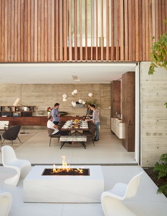
Decor and Design: I like the “Dwell” modern house look. Open spaces, mid-century modern/modern lighting and furniture.

Decor and Design: Love the inside/outside element to this house and how nature surrounds it. I also like how you can see the colorful bookcase from outside.

Decor and Design: I’m also into minimalism. The Glass Pavilion, designed by Steve Hermann, is a Montecito, Santa Barbara home that sold for $24 million. The whole house is wrapped around in glass.

Decor and Design: I love Eames chairs, all white walls and/or floors and statement piece lighting. Mostly, I like things clean, modern, timeless and pretty.

Decor and Design: I’m obsessed with the black Eames lounge chair. Wouldn’t it be great to have a reading nook like this is your house?

Decor and Design: In this bedroom, love the simple art that’s hanging on the wall, the grays and the pinks. It has a Scandinavian interior feel.

Decor and Design: I love Bocci pendant lighting. Each light resembles a raindrop, to me. It looks so clean, crisp and pretty.

Nature: Speaking of pink, I love pink peonies. They’re my favorite flower. They bloom beautifully and they’re just full, feminine and pretty.

Design and Personality & Mood: This Work Hard & Be Nice To People Print, by designer Anthony Burrill, is the perfect piece to put up in your house. It’s simple but memorable.

Art: I love Max Wanger’s use of negative space. (I know I’m not supposed to list other photographer’s work here but I count this more as art than photography.) This one is so simple yet clever.

Art: Yayoi Kusama’s Infinity Mirrored Room is one of those must visit installations. It blows your mind away. I love how the lights change colors and how immersive it felt. Space is also a big thing for me. I love anything to do with it.
Art: If I had to pick my favorite piece of art of all time it would be Van Gogh’s Starry Night. I love the colors he uses and his swirling lines of the sky.

Art: I love the work of Audrey Kawasaki. It was love at first sight. The way she draws the female form is like no other. Her girls are always on the precipice of adulthood, beautifully innocent but looking for adventure. No one does pop surrealism like her.

Art and Design: I love the work of Olly Moss. This Star Wars set of his is clever and unique.

Decor, Design and Nature: I like how this wood table is embedded with a glass river. It’s beautiful and interesting.

Design and Music: I love the early iPod commercials where they just used dancing silhouettes with white headphones against colorful backgrounds. It was a groundbreaking example of simple yet brilliant advertising.

Nature and Design: I’m into all things owl. In fact, I own this planter. He hangs out on my desk at work. I also have a small collection of ceramics.

Nature: I can’t get enough of cherry blossoms. Japan is known for their explosions of them in the spring.

Fashion and Design: Though I know Fashion wasn’t included in the subjects list, I thought it would be another great category. Lots of us find inspiration in fashion, whether that means following the latest fashion trends or just incorporated a style into our wardrobe. I love colorblocking, it’s fresh and modern and it never goes out of style. Though pink and red aren’t at two ends of the color wheel, they compliment each other nicely. (Also like this Kate Spade skirt.)
Advertising and Art: Advertising is another one of those categories where you can draw inspiration from. The KENZO fragrance video, directed by Spike Jonze, left me speechless this year. It was fresh, cool and strangely interesting.
Above: This Christian Dior ad is probably one of the most memorable print ad campaigns I’ve ever seen. I love everything about this, how it’s whimsical, how there are colorful balloons lifting the woman up, the bright pink dress, and…Paris!
In conclusion: What have I learned? I’m big into mid-century modern design and modern design. How does this translates into photography? I love clean lines and white backgrounds and I like photographs that feel timeless. I love color but only when it feels fresh. I’m not into trends, rather, I appreciate things that can stand the test of time. I love images that are pretty, that are slightly more on the feminine side. I like when photographs give me an “aha!” moment, when it take a few seconds to click. I appreciate uniqueness and beautiful design.




0 comments