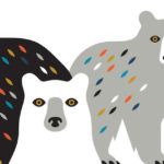
I’m loving this fun bears illustration by brothers Matt and Andrew McCracken of Doublenaut. It has this cool, retro vibe to it yet it’s still modern. Recently, the two were interviewed by Adobe’s Create about their creative process.
Here’s are a few quotes, about their style, that I liked:
“Matt: We’re inspired by mid-century modern graphic design—simple illustrations that are geometric, with bold color schemes and simple type.”
“Ross: That era of design is timeless. It’s not about trends. It’s simple, clean, well-thought-out. You could use a poster from the mid-1960s now and it would be still be relevant.”
Read more about them over at Adobe Create.



0 comments